Quick assembly without tools.
Save time and personnel. Thanks to the modular plug-in system, assembly is intuitive and quick, without the need for tools or technicians.

What exactly is a bleed? How do I create the perfect design? And what do I need to consider when exporting my data to achieve optimal print results? As experts in backlit print designs, we know our customers' questions – and we know the answers.

After each order you will receive an email containing a link to the upload center.
Create print data for simple motifs

Print data sheets for:
To create optimal print data, it's recommended to know and understand some of the technical terms used in printing technology and optimization. We've summarized and explained the most important ones here for our customers.
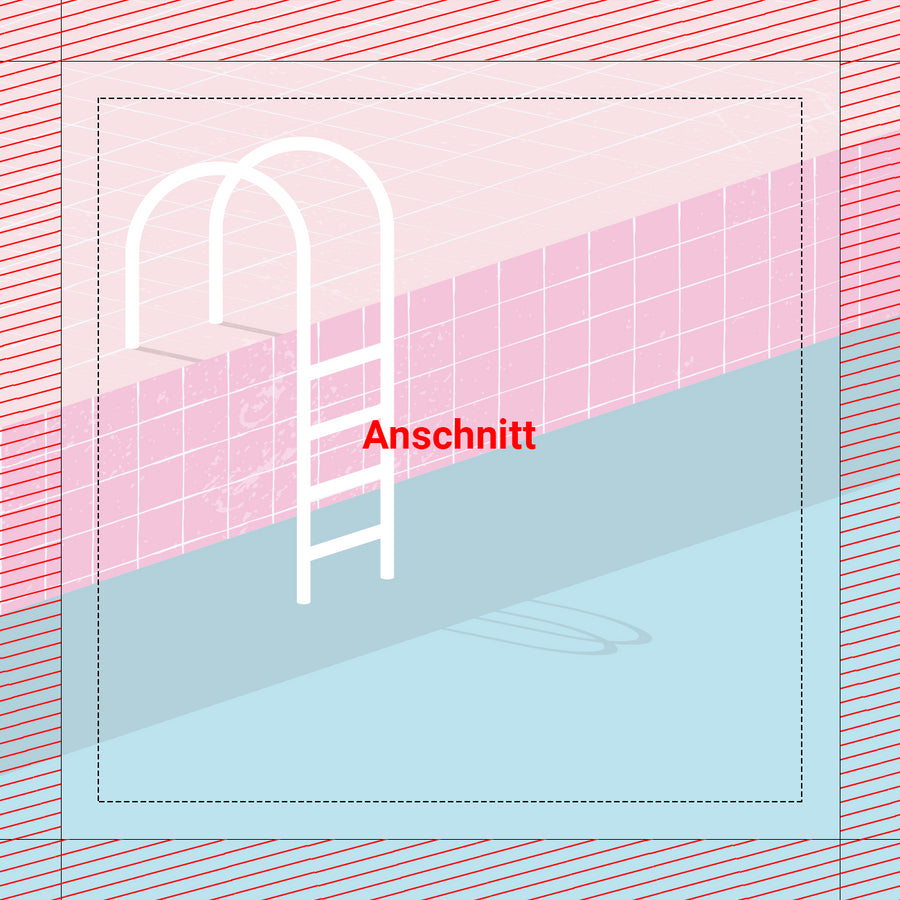
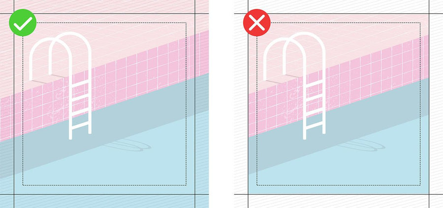
The bleed is the area outside the blank that will be sewn with the rubber lip after printing. To avoid white flashes, it should be 1% per side length all the way around. For frame sizes under 2000 mm, a 20 mm bleed is required. Regardless of whether it's a photo or a graphic design, the background of the print file should fill the entire bleed area.
For a frame size of 1000 x 3000 mm, the print data size is 1040 x 3060 mm. The fold, cut, or registration marks commonly found in layout programs must not be activated within the data format.
The protective zone lies within the cut and describes the area within which text, important parts of a photo, logos or other design elements should be placed. The area outside this zone is a maximum of 20 mm. To ensure that all details remain visible in the final format, all important elements of the design should be within the protective zone. The printed textiles have a high stretch content, so there is a risk, especially with large motifs, that edge-facing elements disappear with the rubber lip in the frame. Contours and borders of entire motifs are not recommended. Due to the flexibility of the textile, they may turn out slightly uneven or off-center.
A process color is created by printing specific colors at different screen angles. In the classic four-color printing we use, these are cyan, magenta, yellow, and black. Therefore, the submitted print data should be in pure CMYK. Color deviations may occur when using Lab or RGB color spaces.
The final size of the textile print is called the cutout. This is the area of the motif that will later be backlit in the frame and is identical to the frame dimensions ordered.
The dpi number indicates the dot density in image reproduction and is therefore one of the quality aspects of printing. The abbreviation stands for dots per inch. The finer the dot density, the more clearly these printed dots blend to the human eye and the better the print result is perceived. Since we are printing on a textured surface (fabric), we require a lower resolution (dot density) of 72 dpi than, for example, paper printing (300 dpi).

At PIXLIP, we offer our customers two different printing processes. Below, we outline the advantages and disadvantages of each process, and which method is best suited for which purpose
UV printing is considered particularly environmentally friendly because it contains no volatile organic substances. The ink is cured with ultraviolet (UV) light immediately after being applied to the textile surface. Unlike sublimation printing, the ink does not penetrate the fabric, but instead creates a satin finish on the material. This process enables razor-sharp and brilliant textile prints. UV curing ensures high print stability and protects against yellowing, making it suitable for outdoor use. The prints can only be stored and transported rolled up.
Sublimation printing is one of the so-called transfer printing processes. The dyes in the pre-printed transfers become gaseous under the influence of heat and pressure and thus migrate into the open pores of the textile fiber. This process is called sublimation. As the temperature and pressure decrease, the pores close and the dye is firmly anchored in the fiber. This results in extremely high durability. The prints can be folded and stored and transported cost-effectively.
Nothing is more inspiring than a blank sheet of paper. It's the opportunity to create something unique—or, in fact, the necessity. After all, how does an idea actually become the compelling design your boss is always talking about? We'll show you how a vague thought becomes a concrete core message and how a sketch becomes the perfect poster.
A crucial principle from engineering applies to successful marketing: Keep it simple and short. Especially at trade fairs and in shop windows, even backlit advertising motifs only achieve an average viewing time of 1–3 seconds, during which the entire message must be absorbed and decoded. This requires precision and condensation of the message. We therefore recommend limiting it to a maximum of five core elements: a short, concise headline combined with a clear and high-contrast layout of the background, packshot, and other visuals, as well as the company logo.

Good advertising is a balancing act. Despite its simplicity, it must convey sufficient information to convey the advertiser's message. Therefore, when structuring the illuminated motif, a hierarchy should be established in advance, taking into account the viewer's future gaze and reading direction. To accelerate the decoding process, all design elements should also be positioned clearly and distinctly from one another. Overlaying packshots and brand symbols with other image components should be avoided.

Especially in a trade fair environment, the correct positioning, color scheme, and dimensions of the brand logo are crucial. As a visual representation of the sender, it is an important component of the corporate identity and, as such, is stored in consumers' minds. Logos should therefore be visible even from a great distance and be effectively placed according to the design hierarchy.
Every advertising motif is based on a key visual, which underpins the central message of the design. This can be products, people, slogans, or logos. However, it is important that they are highlighted as central elements and positioned prominently. To emphasize their importance, it is recommended to emphasize this prominence by displaying them proportionally larger than subordinate elements. Ideally, the size should be at least 40% of the format height.
Backlit motifs don't always have it easy either: Especially in the trade fair industry, they have to assert themselves in a visually overloaded and overstimulating environment. Colorless designs can't cope with these demands. They get lost. The correct use of color accents and contrasts, however, creates exciting image compositions. Differentiating the elements in color enhances the striking effect

Long-distance impact is a key aspect of design. To ensure good legibility of headlines, a font size of 12-15% of the format height is considered ideal. For sublines, however, a font size of 7-10% of the height is recommended. To avoid disrupting the reader's reading flow, a maximum of three font sizes should be mixed.

A textual advertising message is successful if the viewer can grasp it within two seconds. Slogans or headlines should therefore be a maximum of five words or two lines.

Backlit advertising motifs promote an overall positive perception of the message. Combined with a friendly design, this external effect leads to increased attention and improved recall on the part of the recipient. The inclusion of faces, in particular, is intended to support this effect.
Save time and personnel. Thanks to the modular plug-in system, assembly is intuitive and quick, without the need for tools or technicians.
Our backlit systems ensure eye-catching presentations at trade fairs, events, and POS. The interchangeable textile prints can be flexibly adapted at any time.
Our products are manufactured in Germany and undergo rigorous quality testing. You receive durable systems that meet the highest professional standards.